A Practical FLUX 3 Workflow for Product Images That Stay Consistent
A repeatable way to turn one product concept into a useful set of campaign images with clearer prompts, controlled variations, and a simple review process. Use this workflow to spend less time chasing lucky generations and more time selecting strong creative directions.
A Practical FLUX 3 Workflow for Product Images That Stay Consistent
A new image model is most useful when it helps you make a set of decisions, not when it gives you one attractive surprise. The current FLUX 3 conversation is a good excuse to tighten the way you build product visuals. Instead of asking for a finished ad in one huge prompt, treat each generation as a shot in a small campaign: establish the object, choose a visual direction, then vary one thing at a time. That approach works whether you are making a launch card, a storefront hero, a tutorial cover, or a week of social posts. It also makes reviews much easier. You can explain why one image won: the silhouette reads, the product is framed well, the background supports it, and the scene has room for the layout you need.
Start with a shot system, not a style adjective
Words such as "premium" or "cinematic" are vague on their own. They can still help, but only after you define the visible choices behind them. Before opening your image tool, write five short lines:
- Subject: What is the product, and which physical details must remain recognisable?
- Job: Is this image trying to explain, tempt, compare, or set a mood?
- Camera: Is it a close product study, a desk-level scene, a wide hero, or an overhead composition?
- Materials: Which surfaces make the product believable, such as brushed metal, frosted glass, knit fabric, or recycled paper?
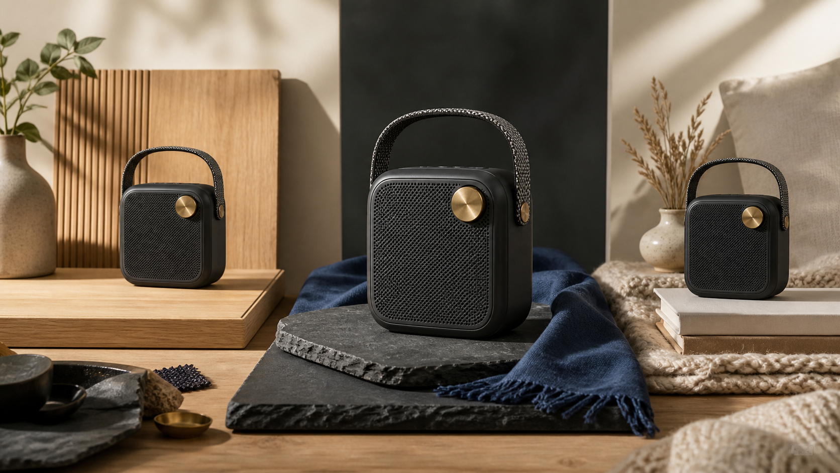
- Layout: Where must empty space remain for a headline, crop, or button? For a hypothetical portable speaker, the first brief could be: matte charcoal body, woven handle, one visible control dial, warm workshop table, three-quarter view, natural window light, and clear space on the left. That is much more actionable than "make a cool speaker ad."
Build the first image for truth, not novelty
Your first pass should answer one question: does the product look right? Keep the environment calm and the composition ordinary enough to inspect. A quiet studio still life often beats a dramatic scene at this stage. Try a prompt like this:
Editorial product photograph of a compact portable speaker with a matte charcoal housing, woven fabric carry handle, and one round brass control dial. Three-quarter view on a pale oak workbench, soft daylight from the right, restrained shadows, sharp material detail. Leave clean negative space on the left third of the frame. No people, no text, no logos, no watermark.
Generate several candidates from this same brief. Do not immediately rewrite the whole prompt when one result is slightly wrong. First label what changed: handle shape, dial placement, product scale, lighting, or background. This turns your next prompt into a targeted correction rather than another roll of the dice. A useful rule is to keep only two or three strong images from this pass. Your goal is a stable visual anchor, not a giant folder of near misses. In Quby, save that anchor alongside the brief so a collaborator can see both the selected image and the intent behind it.
Lock the important details before you explore
Once you have a usable anchor, split your prompt into two parts. The first is the locked description, which should remain almost unchanged. The second is the variable, which is the one decision you are testing. For example, keep this locked block in every variation:
Keep the compact matte charcoal speaker, woven carry handle, single brass control dial, three-quarter product view, and realistic proportions.
Then test a single variable. For a seasonal campaign, the variable might be the surface and mood:
Place it on dark slate beside a folded indigo wool cloth, with soft overcast window light and a quiet early-morning mood. Preserve generous negative space in the upper left. No text, no logos, no watermark.
Run four variations, then compare them side by side. If you change the product, room, camera, season, color palette, and lighting in one request, you cannot tell why the result worked or failed. One variable per round gives you a dependable creative record.
Use a deliberate progression of scenes
A product campaign rarely needs ten versions of the same table shot. It needs different jobs covered. Once the object is stable, work through a short scene list:
- The proof shot: clean framing that shows what the product is.
- The material shot: a closer crop focused on a tactile detail.
- The use-context shot: the product living in a believable environment.
- The contrast shot: a bolder color or light direction for social feeds.
- The utility crop: a composition designed for a narrow banner, card, or vertical post. For the speaker, a material shot could focus on the tension in the woven handle and the brushed edge of the dial. A use-context shot could place it on a shelf in a lived-in reading nook, while keeping the product clear and not hiding it behind props. The contrast shot could use a single pool of warm light against a deep blue wall. Each image earns its place because it has a different communication job.
Review with criteria you can defend
Pretty is not a review criterion. Use a short scoring list instead: product accuracy, silhouette, lighting, composition, brand fit, and crop flexibility. Give each candidate a quick score from one to five. If an image is beautiful but the control dial moved or the silhouette got lost, it is a reference for mood, not a final asset. This is especially valuable when a team is moving quickly. A review note like "strong material texture, but the left crop has no copy room" tells the next person exactly what to adjust. Quby can hold the selected images, prompt versions, and comments in one working space, which is a lot more useful than passing screenshots around a chat.
Prepare the final file for the place it will appear
Before you export, check the image at its real crop. A 16:9 blog thumbnail, a square feed post, and a tall story frame make different demands. The subject should survive a small preview, and important edges should not be one crop away from disappearing. If the image needs copy later, leave a calm region with low visual detail rather than hoping text will fit over a busy reflection. Also check for the predictable failures: accidental lettering, extra controls, hands with odd geometry, inconsistent reflections, or props that imply the wrong use case. Fix these with focused prompt changes. Do not discard a good composition because a small detail needs another pass. When you are ready to turn a product idea into a usable image set, start with one well-defined proof shot and move through controlled variations. You can try this workflow in Quby with a single product brief, then keep the winning prompts next to the images that earned them. The value of FLUX 3 is not a magic prompt. It is the chance to make creative iteration more intentional: define what must stay true, test one visual decision at a time, and ship the images that solve a real layout problem.
Ready to Create with AI?
Put these techniques into practice with Quby's professional AI creative tools.
Launch Creative Suite