Recraft V4 Prompt Guide for Editable Creator Brand Assets
Recraft V4 is useful when a creator needs designed images, editable icons, or brand visuals instead of another loose concept render. This guide shows how to choose raster or SVG output and prompt for assets you can actually use.
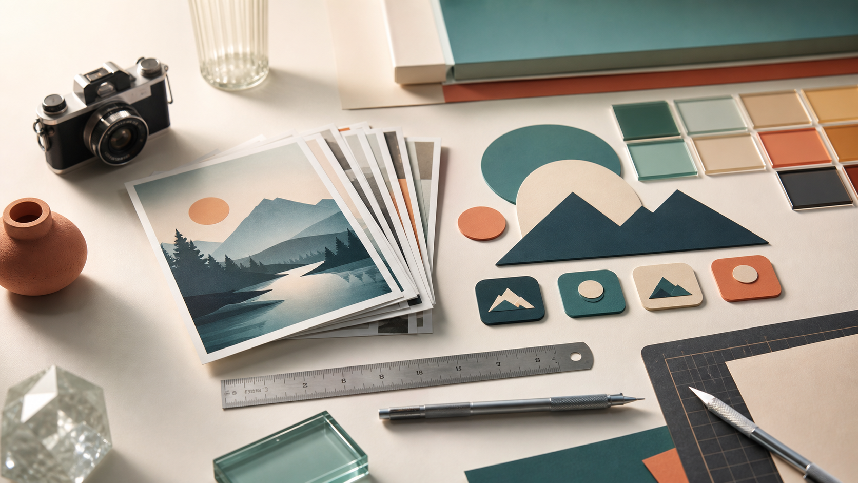
Recraft V4 Prompt Guide for Editable Creator Brand Assets
Recraft V4 is a useful trend for creators because it sits closer to design production than casual image generation. The current Replicate source hook points to a model built for brand assets, illustrations, icons, product scenes, and SVG style work. That matters when the output is not just a pretty image. It has to fit a thumbnail, match a product demo, sit inside an edit, or become part of a repeatable visual system. For Quby creators, the practical question is not simply what prompt looks cool. The better question is: what type of asset am I trying to make, and how editable does it need to be afterward? If you answer that first, Recraft becomes much easier to direct.
Start With The Asset Job
Before prompting, name the asset job in one sentence. This keeps the model from making a generic poster when you need a reusable design part. Good asset jobs sound like this:
- Create a square product thumbnail for a skincare launch
- Make a set of five matching icons for a video editing feature page
- Design a sticker style mascot that can be reused in social posts
- Create a clean hero object for a tool landing page
- Build a vector friendly badge for a creator campaign Weak asset jobs sound like this:
- Make it premium
- Make it look viral
- Create a cool brand image
- Make an AI design for my product Those weak prompts leave too much open. A model can guess, but it may guess a campaign poster, a UI screenshot, a 3D scene, or an illustration style you cannot reuse. A strong job statement tells the model what format the image should serve.
Choose Raster Or SVG Before You Prompt
Recraft style workflows are valuable because they can support both polished raster images and vector oriented output. You should decide which direction you need before writing the first sentence. Choose raster when the asset needs texture, lighting, product depth, soft shadows, material detail, or a thumbnail ready scene. Raster is the right choice for a creator workbench, product mockup, social hero, atmospheric still, or background plate. Choose SVG style output when the asset needs clean shapes, simple color blocks, editable forms, crisp icons, badges, interface marks, or consistent graphic elements. SVG is the right choice for icon systems, stickers, logo drafts, simple badges, and flat editorial graphics. A quick rule: if you expect to crop, grade, or use it as a finished image, prompt raster. If you expect to recolor, resize, align, or combine it with other design parts, prompt SVG style. Do not ask for both at once unless you are testing. A prompt that says photorealistic glass product shot and editable flat vector badge at the same time will usually produce a compromise.
Build The Prompt In Design Layers
A strong prompt has five layers: asset type, subject, style system, layout, and constraints. Use this structure:
Asset type: square thumbnail illustration for a creator tool.
Subject: a compact workbench where image cards, color swatches, and small 3D props are being arranged.
Style system: editorial 3D, clean shapes, tactile materials, warm metal, glass, paper, soft studio light.
Layout: central object group with empty space around it for cropping, no text.
Constraints: no letters, no logos, no UI screenshot, no watermark, no random icons.
The important part is the style system. Many prompts say minimal or premium, but those words are not enough. Name the materials, edges, lighting, and composition instead. For example, instead of this:
Make a premium AI design thumbnail for a product launch.
Use this:
Create a 16:9 editorial product thumbnail. Show a small matte white device on a walnut desk, surrounded by three neat color swatches, a folded paper storyboard, and a single softbox reflection on the device edge. Use quiet studio lighting, clear object silhouettes, realistic scale, and a clean crop. No text, no logos, no screens, no people.
The second prompt gives the model objects it can place, materials it can render, and limits it can respect.
Prompt Example For A Product Thumbnail
Use this when you need one image for a launch, tool page, or creator demo.
Create a 16:9 editorial 3D product thumbnail for a new creator tool.
Scene: a compact desk workbench with a small camera, a stack of generated image cards, one color palette strip, and a tiny clay model prop.
Subject: the image cards are the hero, arranged like a neat fan across the desk.
Style: high quality 3D diorama, tactile paper, brushed metal, soft plastic, warm white studio light, realistic shadows.
Composition: camera at a shallow top angle, strong center focus, clean negative space at the upper left, no text.
Color: white, graphite, teal, warm amber, small red accent.
Constraints: no logos, no letters, no watermark, no UI screenshot, no hands, no random symbols.
This prompt works because the scene has a real physical metaphor. It is not asking for AI magic. It is asking for a creator workbench where visual choices are being assembled.
Prompt Example For An Icon Set
Use this when you need matching design parts rather than one finished scene.
Create five matching SVG style icons for a creator editing app.
Icons: crop, replace background, color tune, export, asset library.
Style: simple geometric line and filled shape mix, rounded but precise corners, two color palette, no gradients, consistent stroke weight.
Layout: each icon centered on its own invisible square tile with equal padding.
Color: charcoal stroke, pale cyan fill, one small coral accent only where useful.
Constraints: no text, no letters, no logos, no shadows, no 3D, no photoreal objects.
For icon sets, consistency is more important than surprise. Ask for equal padding, consistent stroke, and a limited palette. If the model makes one icon more detailed than the others, regenerate with stronger constraints rather than trying to fix all five manually.
Review With Production Criteria
After the first result, judge it like a designer, not like a prompt collector. Use this checklist:
- Can the asset be understood in one second?
- Does the format match the job, raster or SVG style?
- Are the shapes clean enough to crop or reuse?
- Does the palette have enough contrast?
- Are there any fake letters, marks, or logo like artifacts?
- Could this asset sit next to yesterday's assets without looking unrelated?
- Is there a clear place to add real text later if needed? If the answer is no, change one prompt layer at a time. Do not rewrite everything. If the style is right but the layout is bad, adjust only the layout. If the layout is right but the output has fake text, strengthen the no text constraint and simplify the object count.
Make A Small Asset System
The best use of Recraft V4 is not one image. It is a small set of assets that feel related. Start with one master style line:
Style system: editorial 3D diorama, tactile paper cards, brushed metal tools, clear glass accents, white studio table, warm side light, charcoal and teal palette, one coral accent.
Then reuse it across a thumbnail, icon set, badge, and social background. Keep the subject and layout changing, but keep the style system stable. This gives you variety without losing recognition. Inside Quby, this is especially useful when a video project needs a thumbnail, background cards, and reusable visual elements for the edit. Keep the source prompt next to the assets so you can generate another matching piece later instead of starting over.
A Simple Three Pass Workflow
Pass 1 is format. Decide raster or SVG style and generate the simplest version of the asset. Pass 2 is composition. Add crop, padding, subject placement, and negative space. Pass 3 is system. Add palette, material rules, and matching constraints for future assets. This order keeps you from polishing the wrong thing. A beautiful raster scene is not useful if you needed an editable icon. A clean icon is not useful if you needed a textured thumbnail. Near the end of a project, bring the selected assets into Quby and test them in the real context: thumbnail crop, mobile preview, video timeline, or landing page slot. That is the fastest way to catch crowded layouts, weak contrast, and details that disappear at small sizes. Recraft V4 is strongest when you treat it like a design assistant with a clear brief. Name the asset job, choose raster or SVG style, prompt in layers, and review the result against production criteria. The output will feel less like a random generation and more like something ready to use.
Ready to Create with AI?
Put these techniques into practice with Quby's professional AI creative tools.
Launch Creative Suite