Design an App Icon That Still Works at Small Sizes
Use Quby Icon Generator to develop one clear shape, preview it at small sizes, and verify exports against current platform guidance.
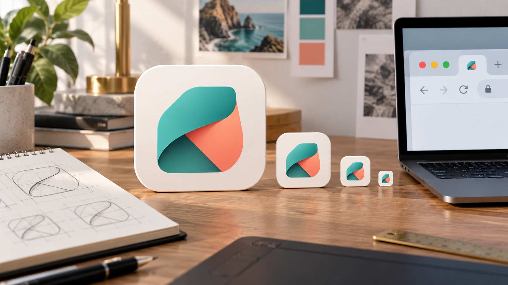
An app icon can look polished at 512 pixels and become a colored blur at 32. The solution is to design one recognizable shape first, then test it in the sizes and masks where people will actually see it. Exporting a large image into a folder of smaller files is the last step, not the design test.
This guide uses Quby Icon Generator to develop a simple concept and preview an icon family. Quby's public tool page shows outlined, filled, duotone, gradient, isometric, and glyph styles, plus size previews and platform presets. The linked studio route is reachable, but this research did not confirm signed-in export controls or a completed generation. Check those in your own account. For platform-specific decisions, follow Apple's current app-icon guidance and your target platform's documentation rather than treating a generator preset as approval.
Write the recognition brief
Choose one thing the icon should communicate at a glance. For a reading app, that might be an open page or a bookmark shape. For a weather app, it might be a horizon with one clear sun. Avoid a miniature scene with several objects, a tagline, and a tiny logo. Apple recommends a simple, memorable central concept because fine details are difficult to discern at small sizes.
Write a three-line brief before generating:
Product: a quiet reading app. Core shape: one folded page corner forming a clear bookmark silhouette. Color: deep teal with a warm coral accent. Avoid letters, book-cover photography, and thin outlines that disappear at 24 pixels.
This brief identifies a product idea, a visual anchor, and constraints. It also creates a fair way to compare candidates. If three generated icons all look attractive, ask which one remains recognizable after shrinking, not which has the most polish at full screen.
If an established logo exists, use its brand rules and rights-cleared source files. Do not ask a generator to imitate a competitor's mark. Also avoid presenting an automatically generated icon as a registered trademark. Before a commercial launch, run the normal brand and legal review for distinctiveness and permitted use.
Make one concept in Quby
Open Quby Icon Generator and sign in if requested. Choose the style shown in your account that best fits the brief. A filled or restrained duotone concept is a sensible first test for small sizes because it relies on broad shapes. Quby's public page offers style categories and an instant size preview; the signed-in editor determines the actual generation and export options available to you.
Use a prompt that describes the silhouette rather than a mood board:
A single folded page corner forming a bookmark, centered on a solid deep-teal square. One small coral fold accent. Flat vector-like shapes, generous negative space, no letters, no words, no photo texture, no extra symbols.
Generate only enough variations to compare real design decisions. One can use a single broad shape; another can test whether the coral accent helps recognition. Avoid cycling through dozens of near-identical results. Save the prompt and the exact candidate you choose, so later edits do not quietly replace the approved concept.
Quby's page also presents an outlined style with a nominal stroke width and a preview from tiny to large sizes. Do not assume a thin outline survives every background and device. The smallest preview is the decisive test. If the line breaks or the folded corner becomes ambiguous, use a filled version or simplify the silhouette.
Test the icon in context
Preview the candidate at several real display sizes: a small browser tab or navigation item, a phone home screen, and a larger store listing. Place it beside other icons on both light and dark backgrounds. Can someone identify your icon after a one-second glance? Does the accent remain visible without becoming a distracting dot? If the silhouette looks like a different app category at small size, revise the shape.
Ask a colleague to describe what they see without giving the product name. If they say "a flag" rather than "a page corner," the concept may still work as a brand mark, but you should know the ambiguity. Do not overcorrect by adding tiny labels. Words that are readable at 512 pixels often vanish in an actual tab or notification.
Check masking and padding. Apple explains that icon shapes vary by platform and that systems can apply corner or circular masks. It advises keeping the main subject centered and avoiding hand-drawn masks that fight the platform treatment. A shape pushed to the outer edge may look intentional in a square preview and be clipped in the deployed icon. Use the target platform's templates for final placement.
Export for the destination, then verify the files
Once the concept passes the small-size check, inspect Quby's available export controls. Its public page describes SVG, PNG, and ICO among formats, plus preset sizes. Select the format required by the destination. A vector source is useful for further design work; a raster export may be required for a store or operating system. Do not infer that every advertised package format is available in every plan or current account.
For a website favicon, check the site's HTML and manifest requirements. MDN's web-app manifest icon reference explains that icons can serve different device and operating-system contexts. For Apple platforms, review the live Human Interface Guidelines and the relevant asset-catalog requirements. For Android, review the adaptive-icon guidance because launcher masks and theming can change presentation.
Open each exported file before handing it to a developer. Verify dimensions, transparency, background color, edge padding, and whether the image was unexpectedly flattened or cropped. A folder named "all sizes" is not proof that the files match the current store specification. Keep the approved source, export settings, and a screenshot of the icon in its actual UI context.
Decide when the concept is done
An icon is ready for implementation when it has a distinctive silhouette, stays legible at the smallest intended size, survives light and dark surroundings, and meets the current platform file rules. It need not explain the entire product. The product name, onboarding, and store listing can carry details that the icon cannot.
If the generator produces a detailed illustration that fails at small size, return to the recognition brief. Remove one element at a time. Reduce texture, thicken the main form, increase negative space, or move the accent inward. Those edits are more useful than merely exporting at higher resolution. More pixels cannot make a crowded idea simple.
Bring a one-sentence shape brief to Quby Icon Generator, preview the result at the smallest target size, and export only after the silhouette works. Validate the final package against the platform where it will ship.
Sources: Quby Icon Generator, Apple's app-icon guidance, MDN manifest icons, and Android adaptive icons.
Ready to Create with AI?
Put these techniques into practice with Quby's professional AI creative tools.
Launch Creative Suite